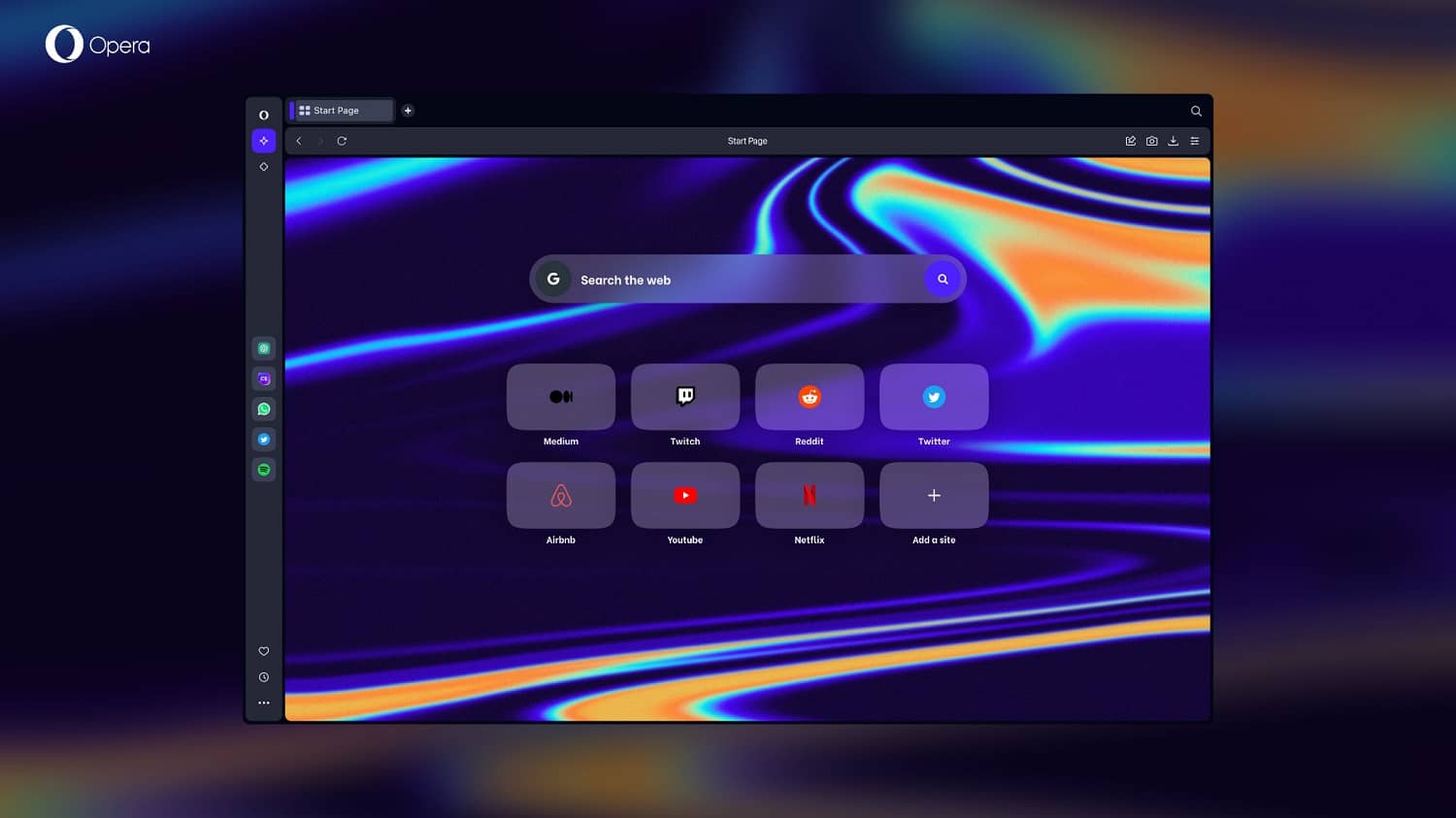
Opera has been a long-time innovator in the world of web browsers, and its latest release, Opera One, proves that the company is still pushing the boundaries of what a browser can do. Opera One is an early access version of a completely redesigned browser that is set to replace the flagship Opera browser for Windows, MacOS, and Linux later this year.
Based on Modular Design, Opera One introduces a liquid navigation experience that is more intuitive and user-friendly than ever before. With a multithreaded compositor that brings the UI to life, and a new Tab Islands feature that helps users manage multiple tabs more easily, Opera One is a major step forward for the browser industry.
Modular Design
Modular Design is a new design philosophy that Opera is presenting for the first time with Opera One. It allows Opera to build a more powerful and feature-rich browser that can adapt dynamically to the user’s needs. Rather than highlighting more and more features, Opera One has been designed with only the key features in mind. The relevant modules within Opera One adjust automatically based on context, providing the user with a more liquid and effortless browsing experience.
The result is a cleaner, decluttered look that provides plenty of space for future AI-based features and extensions in both the browser sidebar and address bar. With Opera One, the new AI Prompts feature, ChatGPT, and ChatSonic are switched on by default.
Multithreaded Compositor
The power of the web has been continuously growing, enabling high-performance graphics operations on websites without interruptions by other processes. With Opera One, Opera is introducing a similar approach to the browser user interface, implementing a new multithreaded compositor to deliver a faster and smoother user interface layer.
Opera One is the first major Chromium-based browser that brings its UI to life like never before. Combined with the new Modular Design Principles, this new architecture enables the implementation of new features and allows Opera to continue its differentiation from other Chromium-based browsers.
Tab Islands
Tab Islands is a new feature that delivers a smooth and intuitive experience built for users who interact with many tabs. According to Opera’s research, the majority of people feel overwhelmed by how messy their tabs get and wish web browsers would do more to help them manage their tabs. Opera One’s new Tab Islands address this challenge.
Tab Islands are a new way of keeping tabs that are related to each other together in an intuitive way – without forcing users to change their habits. As you browse and more tab islands are created, you can easily distinguish the topics you were focusing on and switch between them. In the new, reinvented version of Opera, Tab Islands are the first manifestation of its Modular Design: they are clearly distinguishable in the browser UI, marked by separate colors and clear island borders.
“Tab Islands are a natural way of arranging your tabs into contextual groups without disturbing your flow. They make it easy to keep tabs that relate to each other in groups that you can open and collapse as needed. This makes browsing with many tabs more efficient, allowing for a more pleasant, liquid browsing experience,” said Joanna Czajka, product director at Opera.
Read: Opera VPN Review


