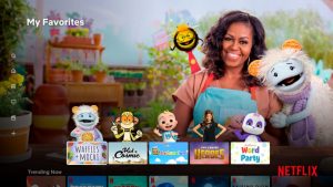
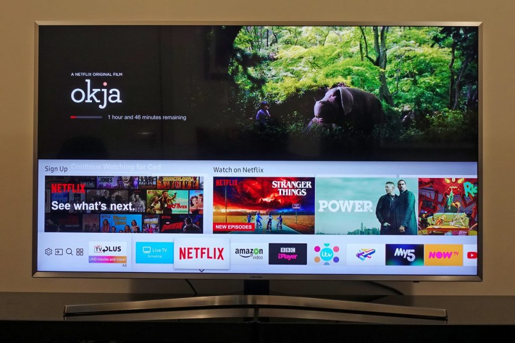
Netflix has revamped Kids Profile, making them more kid-friendly. Switching from the standard horizontal rows, Kids’ profiles are now more visual. The major changes include changing how favorite shows look on the home screen. Kids will now bump into their favorite shows in a visually appealing way, with main characters at the top of each show.
The streaming company says the redesign helps kids easily identify their favorite shows and guide them on what they want to watch next. The favorites will appear prominently on the home screen.
“We wanted to represent a title in the way that kids most recognize it — through the characters,” Michelle Parsons, product manager for kids and family at Netflix, said.
“This is going to be like a kid walking into their own room, where they know where every Lego piece is.”
The redesign follows a test done in 2020, which revealed kids being fond of the new design. According to the company, for a favorite show to be showcased on the home screen, a child must have watched it at least once. These favorites will come from the full catalog and are not limited to Netflix’s original titles.
Here’s how the old and new design compare:


The new redesigned interface is first coming to Netflix’s TV app. Next, Netflix plans to redesign Kid profiles on mobile as well.
Read Next: Netflix Starts Cracking down on Password-sharing


