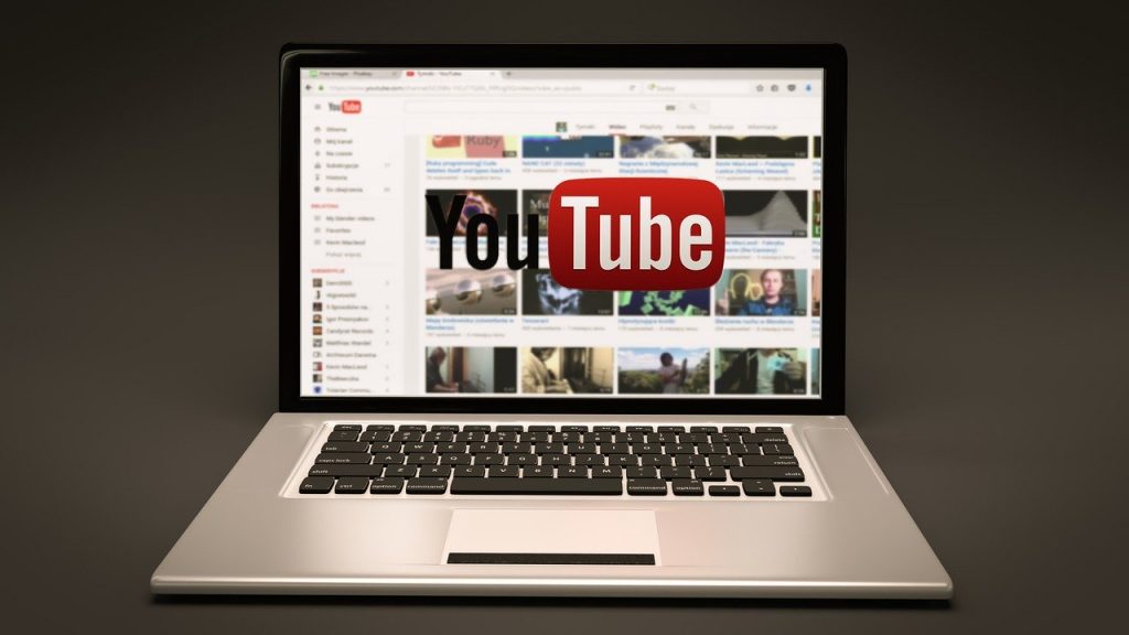
YouTube’s new UI is here to stay whether you like it or not. According to 9To5Google, the company will make it hard for users to revert to the old user interface starting March this year.
The redesign was first seen back in 2017 when the company introduced its current material design that has been implemented in its portfolio of apps. YouTube was the only app remaining with rigid users given a chance to revert back to the Old UI whenever they like.
Google says the modern design has allowed them to bring several features on board (well, including dark mode) in the past three years, but the classic UI is “missing many of the new features and design improvements.”
Starting March, Google says it will notify all loggerheads to ‘Switch to the new YouTube.’ For those using old browsers, you may face issues running the current version of YouTube, and you will have to update your browsers first.
But don’t worry about that, Google will appropriately notify you on what needs to be done to continue using the platform.
Last year, Google overhauled YouTube’s design on desktop introducing longer video titles and larger, richer thumbnails, and higher resolution previews. They also added channel icons below videos, introduced an add to queue option and made it easier to remove suggestions from channels you don’t want to watch.
Google also promised to bring a new feature on the desktop to make it easy to customize your Home screen and the Up Next videos by selecting topics you love.

