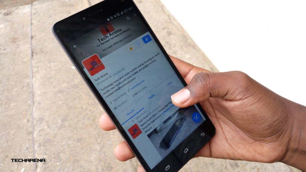
In the latest update, Twitter has revamped its mobile apps on both Android and iOS to treat your lists like different timelines. The feature looks amazing and cuts much of the struggle that needed one to navigate to the list on the main hanging menu.
In the new version, you can add up to five lists on your account which will be visible from the home screen. Lists can then be accessed by swiping to the left directly from your home screen.
Here is an illustration of how the new feature works.
The company started testing the new feature since June this year. The feature allows one to easily customize what they want to see on their timeline – if you have not been using TweetDeck already.
So, the idea is you could customize your timeline based on a given topic you follow closely, or certain accounts without necessarily following them. Besides, the company is also making major changes to the lists’ pages to give it a more eminent look.
According to the company the feature has already started rolling out in the iOS version of the app, and soon enough Android will also be supported.
Now Read: Twitter Suspends Tweeting via SMS Over CEO Jack Dorsey’s account Hack

