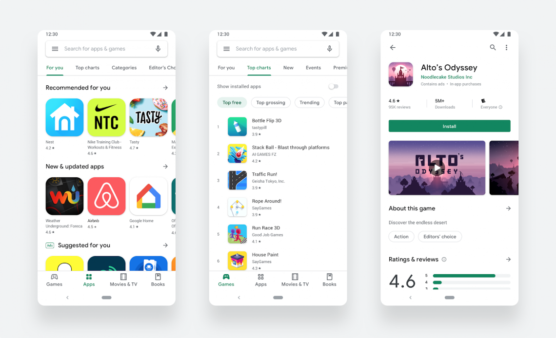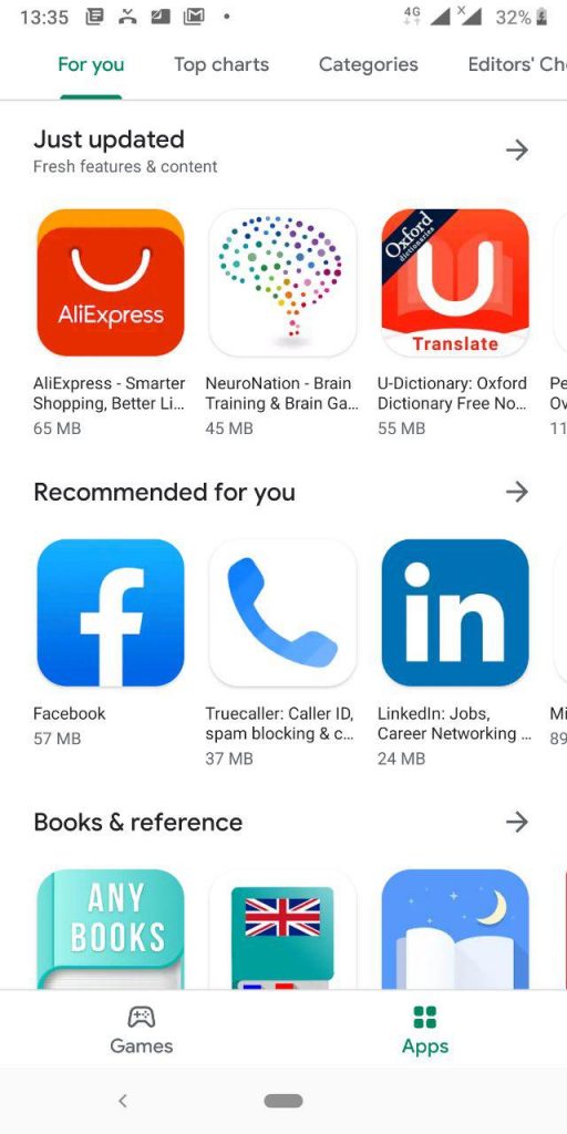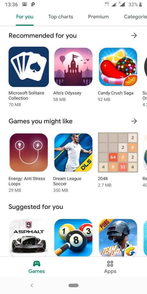
Google has this week released new material design for Playstore. The new design from a first-person view is a cleaner, more streamlined and has already sorted the apps and games in the best way possible.
One thing that you will realize about the new redesign is – just like the previous ones – Google Playstore is getting less green. Instead, the app is now adopting a brighter and white look. As a result, Google Playstore is now cleaner than ever. But that is already becoming a norm to Google in their new Material Design updates – Gmail’s revamped material design update nixed out the red header earlier this year.
Google Playstore new material design has sorted out apps, games, books, and movies &TV shows in separate tabs. For mobile phones, it even gets better with these tabs placed on the bottom rather than on the sidebar – a case for tablets and ChromeOS devices.
I’ve already received the update, and the new design offers a quite impressive look. On the app install page, the green “install” button is now more conspicuous than ever.
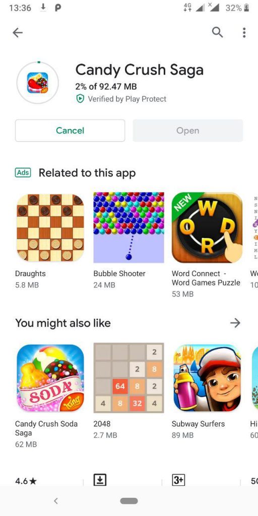
The downloading progress bar when installing an app is now circular around the app icon instead of the linear one at the bottom of the app icon in the old design. App icons are now rounded rectangles across the entire store which according to Google should “help content stand out more over UI.”
Besides, the Playstore now offers app recommendations, be it games or books under a “Recommended for you” section when you maneuver between the different categories. This is not be confused with the “Suggested for you” section which is a category for paid advertisements.
The material design update started rolling out this week and if you have not yet received it, then expect it anytime soon.


