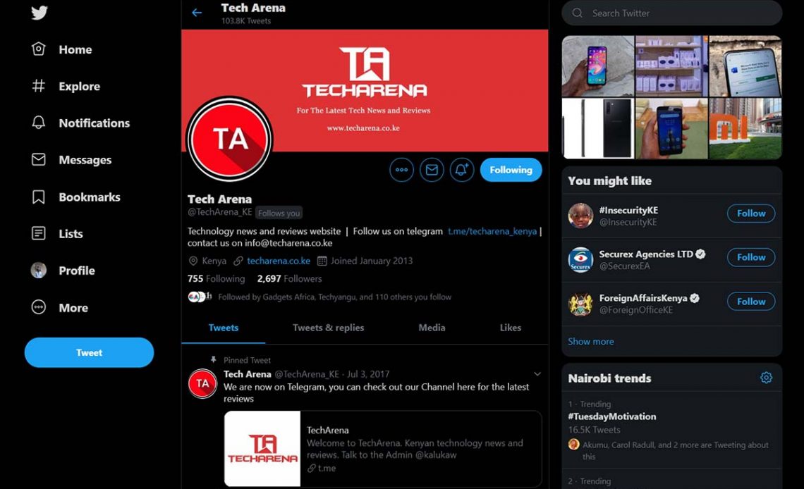
Twitter has revamped its desktop app to make it more fun and engaging at the same time, allowing users to have the chance to explore trends easily.
Wait, and the new Twitter still doesn’t let us have a window to edit tweets in 2019!
The new design allows easy account switching on desktop like on mobile which doesn’t need a user to login and out to switch accounts. Furthermore, the direct message and conversations have now been placed on the same window, which can potentially result in more interactions. Sounds impressive to me, I hope this will help me reply to my DMs faster because I’m often late on replies –like all the time.
The app also brings on board other mobile features like bookmarks and a right-sided menu which has been added with a new option termed Explore. The explore button will allow users to see what’s trending and for a plus, there is a new toggle which will enable you to easily switch between viewing the latest tweets arranged chronologically or top tweets.
One of the most significant changes in the latest update –twitter has moved the top navigation bar to the left, which is now easily accessible without having to perform the usual extra click on your profile.
Also, Twitter is bringing in a dark theme, which is indeed black, unlike the current ‘navy blue-tinged color’ on desktop. This means there will be two color variants to choose from for Twitter’s dark UI.
The new UI has been revealed yesterday night and will be available for all users in a few days to come.
Besides if you will not like the new redesign there’s some bad news for you. Mashable suggests that the new UI is mandatory and there will be no ‘legacy’ roll back to the old version. I haven’t had a chance to hop into the train, but you can see an example of how the new UI looks like in the image featured above.

