I am not a big fan of TouchWiz, and that has been my main factor against Samsung, but now with the signs of a new user interface, maybe it is time for me to get myself a Samsung device.
Rumours have it that the new TouchWiz would debut alongside the Galaxy Note 7 (Yeah, there is no Note 6), but this is yet to be confirmed with Samsung. However, Samsung beta testers in Korea have had the chance to interact with this new UI and through them we have gotten a sneak peak of “Grace UX”.
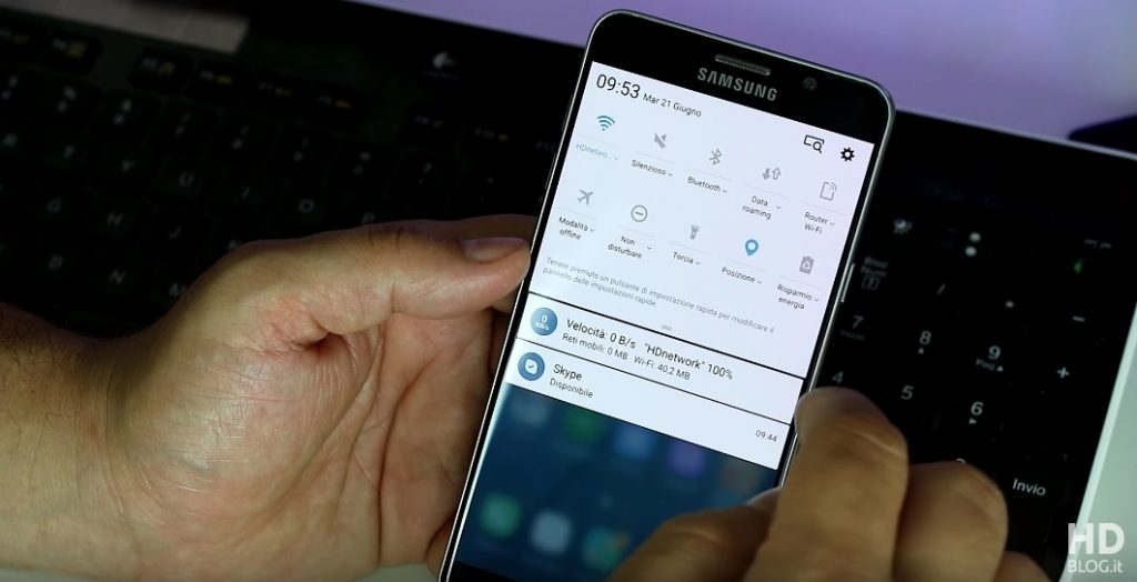
Grace UX, the codename of the new TouchWiz, is more flat, and the icons looks less like they did during the Android KitKat era. There is a lot of use of blur effect, like when one open an apps folder and this also brings a new app folder design, as seen in the image above.
Widgets have also gotten a facelift, you can now change the transparency of any widget. Samsung have also incorporated a “3D Touch-like” function on the new UI. You can access a contextual menu when you swipe up a particular icon, yes it is not as cool as 3D Touch but it gets the job done. In Grace UX, we have a familiar looking notifications drawer but Samsung have now incorpotated more material design animations like we see on stock android. Grace UX also brings a new look in the settings, which looks alot like Android N.
Samsung is set to launch Galaxy Note 7 in August, and with rumours about the device coming up everyday, this is one more thing to look forward to. It had also been rumoured that the Note 7 would launch with Android N, this sort of seems impossible but you never know, we could be receiving Android N and a new set of Nexus devices sooner than we thought.
What do you think of the new TouchWiz look?
Read More: The Samsung Galaxy Note 7 Will Reportedly Come with an Iris Scanner
Source: HDBlog.it

