When it comes to social media, if your engagement numbers are low, you are definitely losing out. All the key players work so hard to get people to their platforms and when this happens they work even harder to keep them there. One of the ways to keep users on the platforms is to make sure they engage with other users and with the content being posted.
In a move aimed at improving engagement, Snapchat has redesigned its Android and iOS apps. This redesign comes less than a week after we reported that the number of daily active users on Snapchat passed the 150 million mark beating Twitter by 10 million.
From the moment you open the Snapchat app, you will see these changes. The icons are all there but have been redesigned slightly. The homepage is not where you will see most of the changes though as at the moment the only changes I see there have to do with the icons.
Discover more things!!

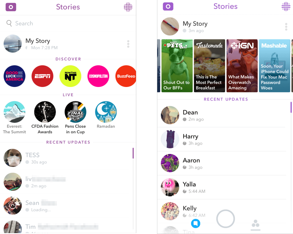
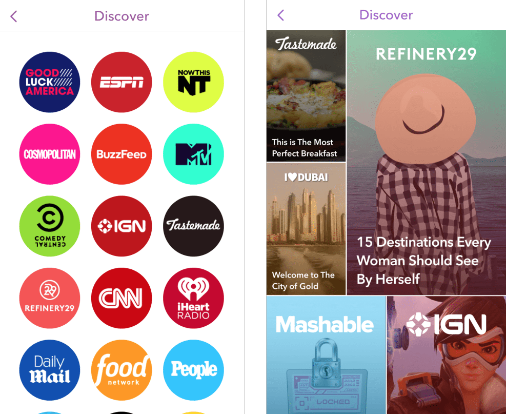
The discover page is what has seen some changes that you will definitely notice. From this page, you can access the stories page and here you will see image and headline previews of the content inside instead of the logos of the publishers we have been used to.
Still on the stories page, your snaps (stories) appear at the top with the stories from publishers appearing below it. The stories page has combined the two rows of static Discover channels and Live Stories into one row that you can scroll through.
Below the scrollable Discover row is where you get snaps from the people you are following. These have not seen any significant changes so far and I don’t think Snapchat has any plans to change that anytime soon.

This latest update also makes it easy for you to access the Discover page. The easiest is just by scrolling through the different stories or you can tap on the icon on the top left section of the app. This brings you the stories arranged in a magazine format. Currently there is no search button here but that is not a big deal since there are not that many stories here.
This latest update also makes it easier to subscribe to the channels you like. You can do so by tapping and holding on the channel on the discover page and you will have the option to subscribe. Still on this, you will have all channel on the discover page whether you have subscribed to them or not.
All about the money
These changes as you may have seen are all about improving engagement. Snapchat is looking for ways to get people to see the stories produced by its partner channels. These changes are all about this and the company wants to make sure that you are watching this stories. Snapchat has had a smooth ride so far but it will get to a point where it will have to make money and advertising is the best option. Making it easier to display the content to users is important if this future is to happen. The company has to produce valuable results for the publishers it is currently working with if it is to attract more of them in the future.
Read More: Snapchat Is Rumored to Be Working On a Wearable Device


