A fee weeks ago, we brought it to your attention that Twitter was working on making their android app more attractive with an emphasis on material design. You can read all about that here.
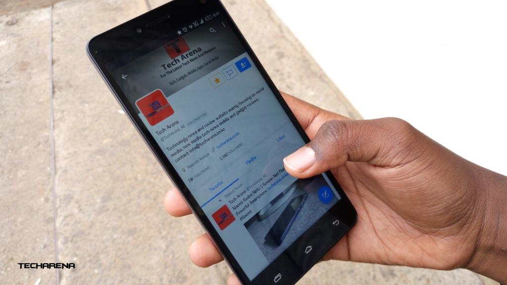
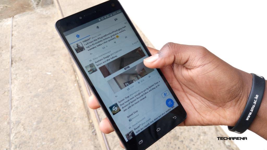
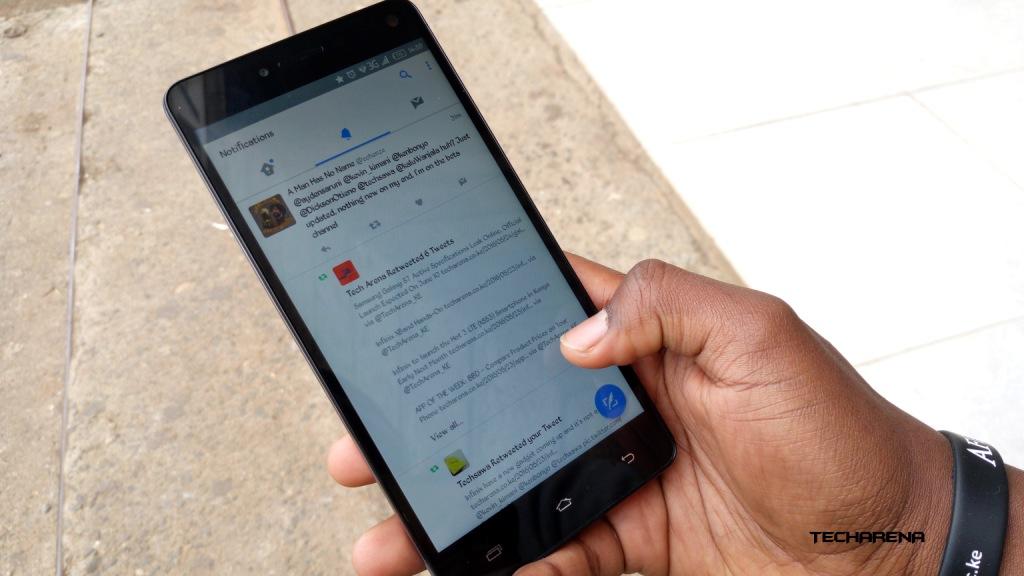
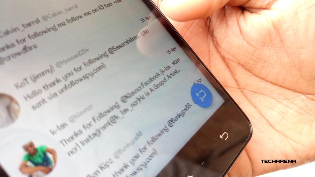
Today we have seen a roll-out of this UI, it looks a bit different from what was seen earlier but I must say, the new look is pleasant. In a few words, what Twitter has done is implemented the material design language into their app. This means we now have a Floating Action Button (the round button at the bottom-right) that will be used to post tweets and create message on the messages tab. The down side is that we no longer have the “mark all as read” on the Direct Messages tab, I hope Twitter will fix this.
Below are images of the new Twitter UI:
I love this new look, and if you have not yet gotten this update, watch out for it.
Read More: Twitter Is Reportedly Working On a Dark Theme That Is Automatically Activated at Night


