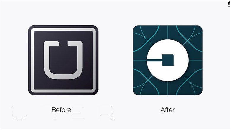
Uber is not new to controversy, almost everything the company has done has always been met with obstruction. This was the case yesterday when the Taxi hailing app changed its logo and decided to share the good news with its fans.
You would have thought that people will be excited with this new logo but this was not the case. The Dailydot said this logo is Ugly while the DailyMail said it is bizarre. Of course there were other publications that had some nice words for this new logo.
Check out the logo below.
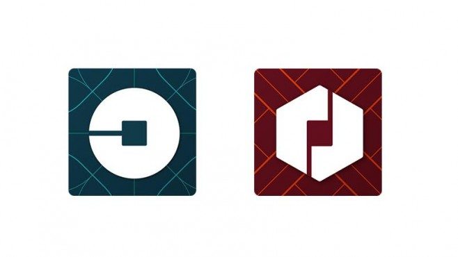
The above shared Logo is what the passengers will see and below is a comparison between what drivers and passengers see. If you still don’t know, Uber passengers and drivers have two totally different apps.
A statement from the company sent to users read, “We used to offer only black cars in a handful of cities. Now we’re a reliable, low-cost way to explore 400 destinations around the world,” the statement said. “We were everyone’s private driver, but today we’re a lot more. Our new look reflects where we’ve been. And where we’re headed.”
Twitter users were not so thrilled with this new logo and most of them took to the site to express their disappointments. One user Tweeted, “I extremely do not “get” the new Uber logo. What..is it”
Another user said, “Dear Uber: your old logo was very bad but useful. Your new logo is very bad and useless. Yours truly, Everyone.”
https://twitter.com/joshuatopolsky/status/694675595901407232
Am not a logo designer but this new logo from Uber is not that bad as some people make it to be. I know there are people who may see it as confusing but I think it looks great. It is always great to see something refreshing and am sure the avid Uber users do not mind it that much as long as they keep getting quality services.
Read More: Some Uber Partner-Drivers in Nairobi Have Been Intimidated and Harassed for Using the Service


