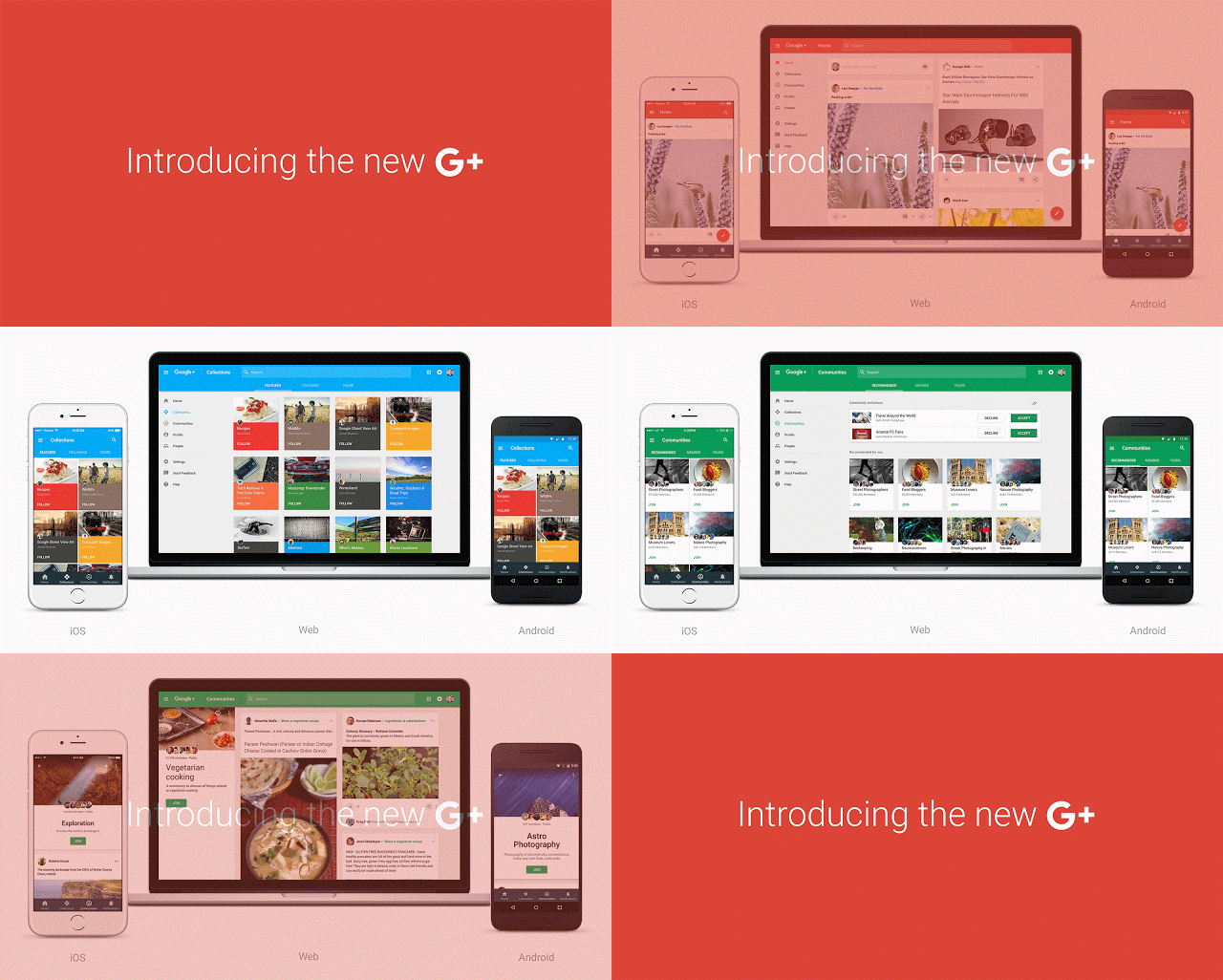
It is clear that Google+ is not the most popular social networking site out there. The site is mostly used by the tech savvy and those who know their ways around the internet. To the common folk, it is more of a unicorn and some people don’t even know it exists.
Google knows this already and that is why the search giant is rebooting it to give it a better design with hopes of attracting more users. Whether this will get people to shift camp to Google+ is a difficult thing to predict at this point as you probably already know by now that things can change anytime.
To start, Google+ is designed to scale very well depending on the device you are using. The same way it works on your smartphone is the same way it works on your tablet. Google has guaranteed this and has said that users have to log in to the site to see the changes. Probably they want you to just log in to the site after all.
The company said, “We’ve reimagined Google+ to help them do that. Today, we’re starting to introduce a fully redesigned Google+ that puts Communities and Collections front and center. Now focused around interests, the new Google+ is much simpler. And it’s more mobile-friendly—we’ve rebuilt it across web, Android and iOS so that you’ll have a fast and consistent experience whether you are on a big screen or small one. You’ll need to opt-in to this new version of Google+ on the web to see the changes—check out our Google+ post for more on how to give it a try.”
When you log in to your account, you will encounter Google+ Communities and Collections right there. These are the two most popular features on the social networking site and Google wants you to see them the very first time you log in. This may not seem as something big for you, but for Google+ it is. It’s part of Google’s plan to get people to use its site frequently.
Will this update make you use Google+? That is a question Google is asking you kindly, personally I use Google+ frequently (daily) so I will continue using it no matter what design they implement.

